About images used in the blog…
Images that appear here are for educational purposes only. If you are a copyright holder and wish to have your images removed, I'll be more than happy to do so.
Images that appear here are for educational purposes only. If you are a copyright holder and wish to have your images removed, I'll be more than happy to do so.
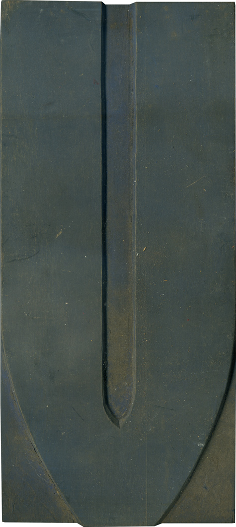
The EndGrain is a website about letterpress printing, with an blog-within-a-blog, Daily Letters, which focuses on the beauty of the wood forms themselves. Future V
Via Cool Hunting, a new Taschen book celebrates the designer who revolutionized music packaging, Alex Steinweiss. In 1940, at 23, Steinweiss proposed using original artwork instead of kraft paper for Columbia's "albums" of 78rpm records. Sales increased 800%. With the advent of the 33rpm LP format, he invented the "album" sleeve that came to be the industry standard. But it is his iconic cover art for Columbia, Columbia Masterworks, [...]
My InDesign education was all of about 1/2 hour at the end of a course, so almost everything I know I learned by trial and error. For my most recent assignment, that isn't enough, but I found this series of tutorials on line that helped immensely. Creative Mentor > Practical Learning for InDesign Users Neil Oliver is an Australian designer and Adobe consultant who has made these 3-minute video [...]
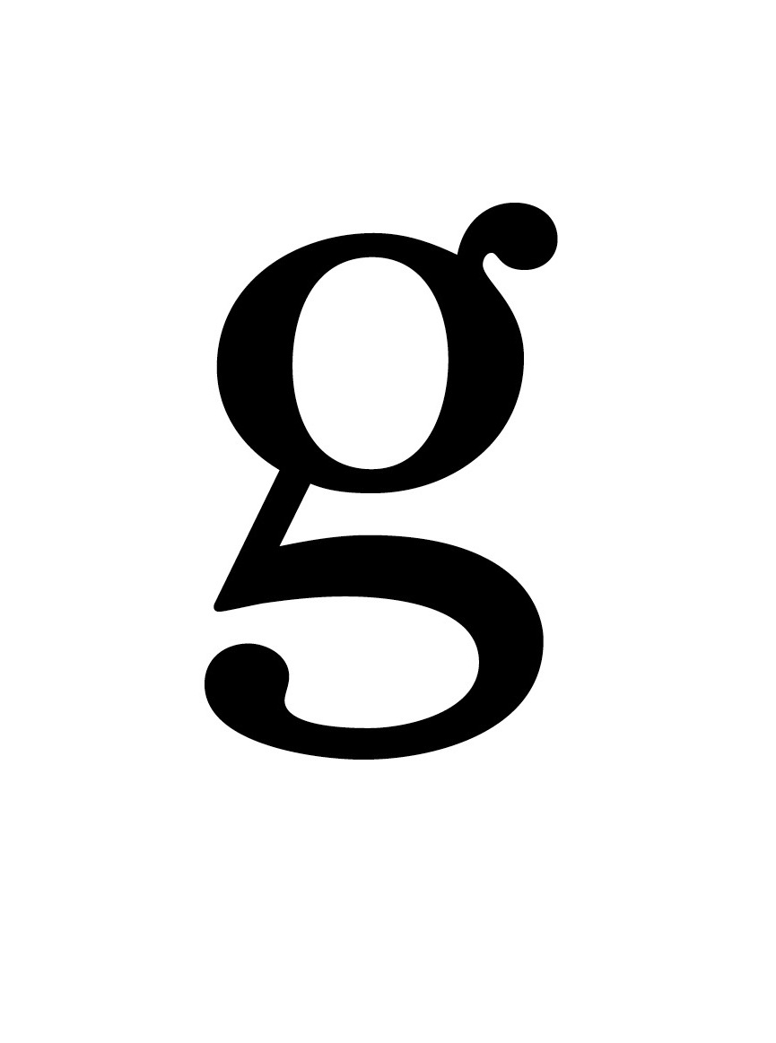
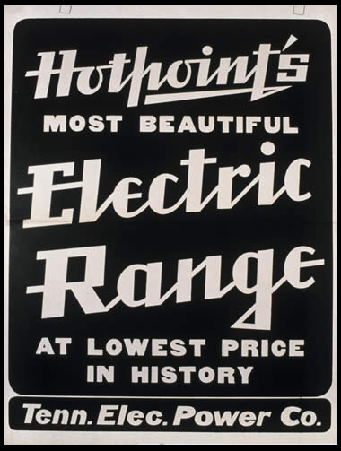
Stalking the New York Times typefaces and fonts: For a class assignment, I have to mock up a NY Times Op-Ed page. I could have asked my friend who works there what fonts they use, but thought that might defeat the purpose a little. For the headline, I went through every font I have and compared this lower-case G until I found the right one - Cheltenham Book. For [...]
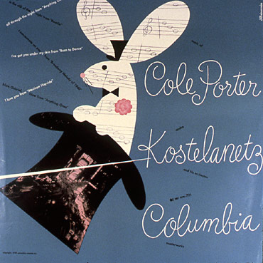
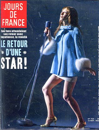
Ran across this on The Daily Beast - The Steven Kasher Gallery just closed an exhibition by Josh Gosfield: Gigi Gaston, The Black Flower. The elusive 60's French pop star is commemorated with magazine covers, album art, photographs, and even a music "video". What a treasury of vintage type! You might wonder, like I did, why I hadn't heard of a world-famous singer who had a music video directed [...]
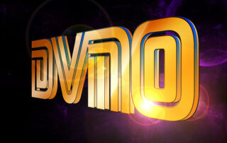
Just for fun -- this video for the French duo Justice is a cornucopia of 80's typographical homages, and has inspired at least one determined blogger to attempt to identify the origins of each typeface. Here is Yves Peters' dissection of the video, from The FontFeed. Interview with Justice about the video and its creators, So Me and Machine Molle.
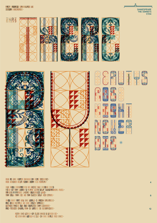
As a type experiment, Simon Egli and Stian Ward Bugten transformed the sounds from Shakespearean words into letterforms (it's over my head, but the generative idea is interesting). The results aren't just conceptually interesting - they're pretty. The second panel above supposedly explains the process - and a short film about it is here. Stian Ward Bugten's portfolio on Behance.
Helvetica is a 2008 documentary film by Gary Hustwit. Celebrating the 50th anniversary of the launch of the ubiquitous typeface, Helvetica also looks at how type impacts our lives. Helvetica trivia: the name was derived from "Helvetia", the Latin name for Switzerland, the home of its designers. Helvetica official website
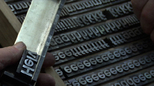
The Hatch Show Print Shop in Nashville opened in 1879, and still designs and prints posters in the original letterpress and wood block style, hand inked, hand cranked, hand cut, and the customers are even called from a rotary phone. The Smithsonian has a traveling exhibition, American Letterpress: The Art of Hatch Show Print. The exhibition website and blog is here. A short video tour of the shop is [...]
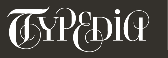
Typepedia is a community for education about, identifying of, and discussion of type. There's a great section with diagrams and examples of the different parts of letterforms: Their logo is wicked cool, too.
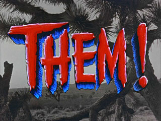
Designer Christian Annyas has an incredible collection of stills from movie openings, endings and trailers that is a typographer's dream. Visit The Movie Title Stills Collection (but be ready to spend a lot of time there!)