Loading...

Neon lights

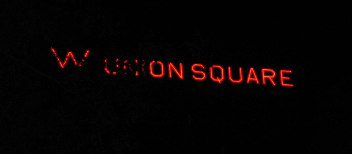
Neon is one of my favorite signage materials, but it's kind of hard to photograph. Here's my lame attempt to snap the W Union Square sign. I can see it from my window: My friend Devyn Caldwell is an awesome photographer who likes to play with moody lighting -- and neon, sometimes emanating from behind security gates, is one of his favorite subjects. Check out Devyn's blog 24Gotham for [...]

Oh! Teninbaum

Another tip from Alison - illustrator/art director Julie Teninbaum has done pieces for Time, Portfolio, Fast Company, Glamour, and tons of other editorial and identity projects. Her specialty appears to be info-graphics - organizing facts into amazing pictorials: She also created an awesome typeface from photos of sparklers! ...and assembled food into letters for this illustration: Julie Teninbaum's website, Oh! Teninbaum

Face Blindness

I'm adding a new category to this blog - don't know if these "phenomenon" posts will be visible to anyone who links from my Typography archives, but here goes. I'm interested in all kinds of things that I'm surprised to find are "things" - and because "things" is too vague, I'll categorize them as phenomena. I used to obsessively read Usenet groups because I was fascinated by the endless [...]

Complexity

I have now recruited my friends to scout type for me! Alison sent me a link to an amazing site - these are screen grabs from a constantly moving arrangement of elements.  The grabs don't do the work justice - you must look! Artist: Takashi Okada

El Lissitzky

Found on CoolHunting: Upcoming exhibition at The Van Abbesmuseum in Eindhoven, Netherlands of the work of El Lissitzky. Here are some images compiled by the Getty Research Institute for their El Lissitzky exhibit in 1998-1989. El Lissitzky also produced advertising art for the Pelikan Ink company: Perhaps most famously, he was the editor and typographer of Dada journal Merz 8/9.

Tibor Kalman

Assignment: research Tibor Kalman and find three examples of his work. And have an opinion. Found this "handy reference guide" he made to re-branding conventions: He was founding director of Colors Magazine ("a magazine about the rest of the world") from its inception in 1991, and was its chief creative force until illness forced him to return to New York in 1995. And this is one of his [...]

Periodic Table of Typefaces

I was Googling "Family Guy typeface" and found this instead: (Click graphic for full image) Back to "Family Guy": last night's episode followed Brian and Stewie through the Multiverse, including a short stay in a universe drawn by Disney. Other universes included jagged bitmapped characters, claymation figures, and one where there was only one guy, very far away, who gave compliments. Fear not, there were also fart jokes. Full [...]

Louise Fili

Assignment: find three examples of work by Louise Fili, and have an opinion about them. You can't get much more iconic than the Good Housekeeping logo.  Louise Fili was hired to return the logo to its historic style for their 100th anniversary.  Story in the NY Times. Here's a graphic from Louise's blog showing the before & after of some of her logo redesigns. In some cases they're a [...]

Vincere

Post for Saturday, September 26. I saw this film tonight at the NYFF on the rise of Benito Mussolini, and the little-known story of his first wife and son, who were both discredited, disowned and placed in mental institutions.  Nice man! There is a scene where Mussolini visits a Futurist exhibit, and director Marco Bellocchio describes the film as "a Futurist melodrama".  The wife and nation are both betrayed [...]

How we earn money

Post for Friday, September 25. Apparently I have not learned anything new about type conventions since I was in college - long before I used a computer. I didn't get the memo that there is now only one space between a period and the start of a new sentence, and have been happily and ignorantly using two. Here's one of my typing exercises from seventh grade. Typing was boring, [...]

Title

Go to Top